Off-screen navigation, flyout menu, navigation drawer, there are many ways to call this common pattern. It’s a great way to save valuable real estate on small devices, and most people is aware of it as many native apps make use of it.
There are hundreds of jQuery plugins out there that can help you achieve this pattern, but I’ve found a simple and clever way to make this work using only CSS, no javascript required. Kudos to Bev from @fofwebdesign for the code. All details and cross-browser code can be found on her Responsive CSS3 Multi-Level, Fly-Out Menu (no JavaScript) post.
What I’ve done is to turn the vertical left-hand navigation into a horizontal one, whilst keeping the left off-screen nav on small devices. As I only need this for prototyping I’ve removed the second navigation level, and most of the code meant for cross-browser compatibility.
In essence, I’ve made it really simple so anybody with basic HTML and CSS skills can use it.
TL;DR
See an example / Another example Grab the code on codepen.io(Resize the browser to check how it works on a small device)
How it works
You’ll need one container for all your content, and another one positioned off-screen for your navigation elements. The latter can be inside or outside the main container. Check the two examples above and you'll see that it’s possible to place your navigation inside your container, or outside.Lastly, you’ll need a checkbox (that we’ll hide from the viewport), and a label to select/unselect that checkbox.
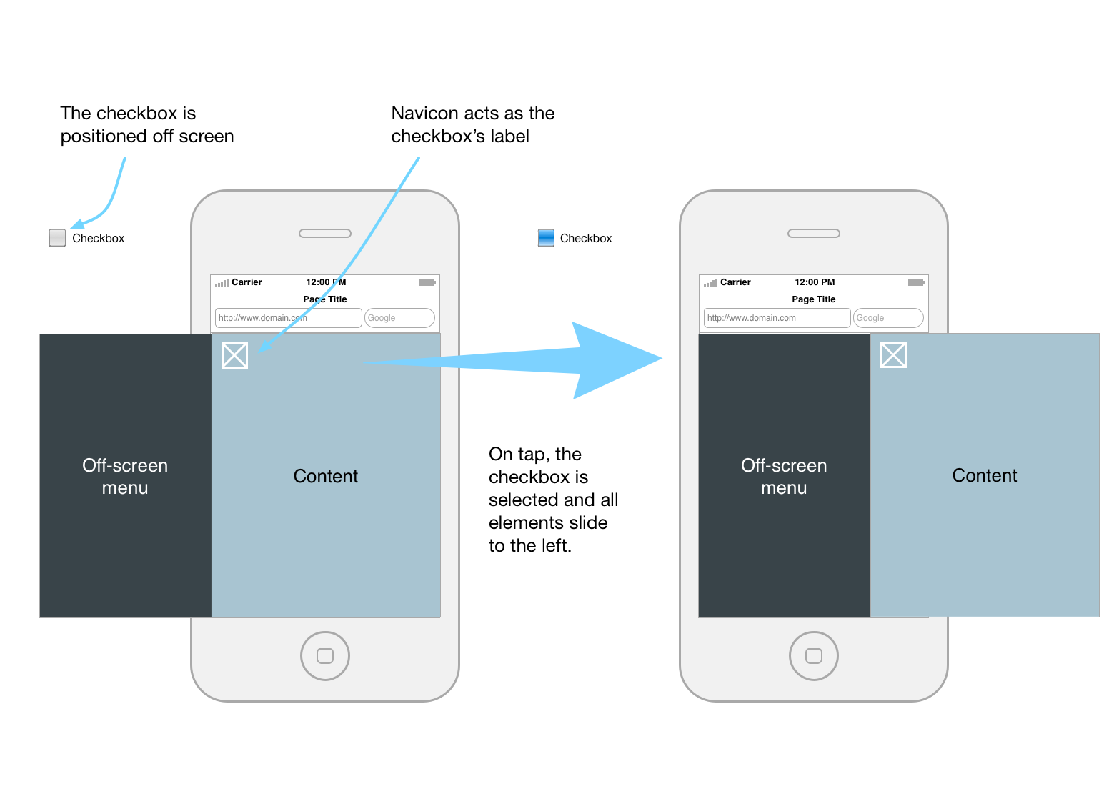
The CSS will make your elements slide in when the checkbox is selected, and slide out when unselected, so no javascript is required.
The code
<input type=“checkbox” id=“main-nav-check”>#main-nav-check { position:absolute; top:-9999px; left:-9999px }
The checkbox is not visible, but it is still important where it sits in your code.
You’ll also need a label to select/unselect that checkbox. And you can make it look like a navicon, or use an image if you want.
<label for=“main-nav-check” class=“toggle” onclick="" title=“Menu”>≡</label>
As we’re using the ~ selector, the checkbox and the two containers we’re going to animate (menu and container) must have the same parent. In this case, all elements have the body as its parent.
body |_ #main-nav-check |_ #menu |_ .wrapper
About the ~ selector - from w3schools:
The element1~element2 selector matches occurrences of element2 that are preceded by element1.So, how does this work? The CSS will check whether the checkbox is selected or no, and move the container (.wrapper, that in this case contains the menu as well), 13.75em to the right. And that’s exactly the width of your off-screen menu.Both elements must have the same parent, but element2 does not have to be immediately preceded by element1.
#main-nav-check:checked ~ .wrapper { -webkit-transform:translate(13.75em,0); -ms-transform:translate(13.75em,0); transform:translate(13.75em,0) }
No javascript required, just be careful to position the checkbox and elements to be moved as child (direct descendant) of the same parent.
Check the codepen here, and examples here and here (resize your browser to check how it works on small devices).