Last week I finally took a deeper look at CSS grid, the new way of creating layouts supported by all major browsers since early 2017. Until now I had just used it for very simple grids, the image gallery kind of ones. An hour of reading later, I was amazed by its power and simplicity.
So what is it exactly? Is it like flexbox?
A key element of CSS grid is that it creates rows as well as columns. That makes the distinction between flexbox and grid very simple:
- Use flexbox for 1-dimensional compositions like rows or columns. E.g. tabs, your primary navigation
- Use grid for 2-dimensional compositions. Like defining a *ahem* grid for your content areas (header/sidebar/main content/footer, etc.)
How it works in a nutshell:
- You define horizontal and vertical tracks, delimited by grid lines
- You assign areas to use one or more cells created by the intersection of the grid lines, in whatever place you like, as long as it forms a rectangle (no Tetris shapes yet)
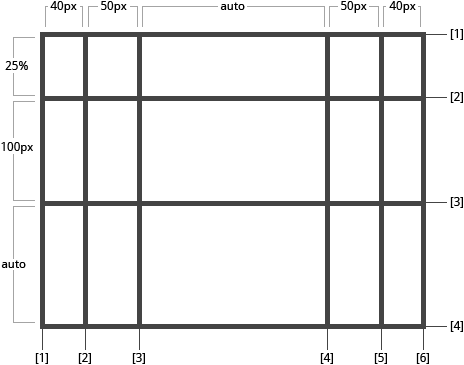
(Image from CSS-Tricks CSS grid guide. You should totally check it out after you've read this)
A key consideration is that you don’t have to fill the grid. Think about it as the holes of your IKEA furniture. You can use them to put hangers and stuff on them if you want to, or leave the shell empty. With the added benefit that the tracks can grow with the content. It's like having a wardrobe that grows as you put more clothes in it!
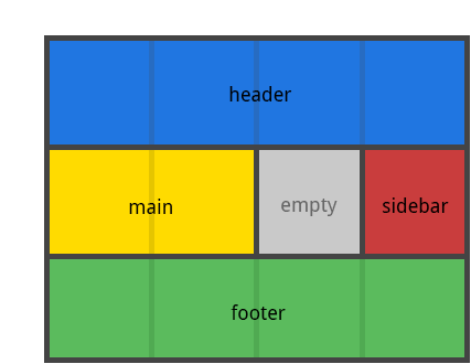
(Image from CSS-tricks)
CSS grid is so flexible that you don’t even have to assign explicit areas. Any child element of the grid will automatically use the next available grid space, from the top left corner (when writing in a western language). That means that you can perfectly layout an image gallery in seconds.
Then you can use CSS to reposition that content, maybe for another platform. This makes the separation of content and presentation a lot easier.
An example
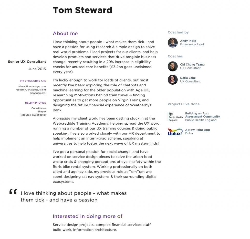
Let me show you what I coded last week. Inspired by Jen Simmons’ Modern Layouts presentation, I wanted to create a layout for our intranet’s staff page that didn’t follow the standard main content + aside columns, but would rather use a more complex layout inspired by print magazines.
Start with the content
Having more flexibility to define fixed sized areas and flexible ones that use any available space, I started with chunks of content without a particular structure. Exploring what width and order were appropriate on different viewports to tell the story of that person, while trying to use a 1.414 scale to ensure all typographic, image and text elements were harmoniously related.
It was an iterative process to assess what seemed like ideal sizes for a given viewport size, and then how the different elements would adapt, what should maintain its size, what could flex.
Early concept of how chunks of content could be positioned:
Create your grid
Once I had a rough composition, I looked at what grid lines and areas would be needed. Time to get off Sketch and into the text editor. Turning those lines and areas into code was a bit of trial and error, but nothing you won’t understand in less than an hour.
#staffPage {
 display: grid;
 grid-template-rows: 10em 8em auto auto auto;
 grid-template-columns: 18.8333333333% 1fr 32.9166666667%;
 grid-column-gap: $baseline*2;
 grid-template-areas:
 "photo name links"
 "photo biog coached"
 "profile biog coachingRel"
 "quote quote coachingRel"
 ". experience coachingRel";
}
With the grid structure ready, adjusting the different breakpoints took literally minutes. Try to do that with a framework!
 @media all and (max-width: $medium-break) {
 grid-template-rows: 10em 4em auto auto auto;
 grid-template-columns: 18.8333333333% 1fr;
 grid-template-areas:
 "photo name"
 "photo links"
 "profile biog"
 "quote quote"
 ". experience"
 ". coached"
 ". coachingRel";
 }
The result
Once you understand how the grid works it’s very simple to create different types of layouts that would have been an absolute nightmare to code using floats, opening the door to thousands of ideas that would've been considered crazy just a few months ago.
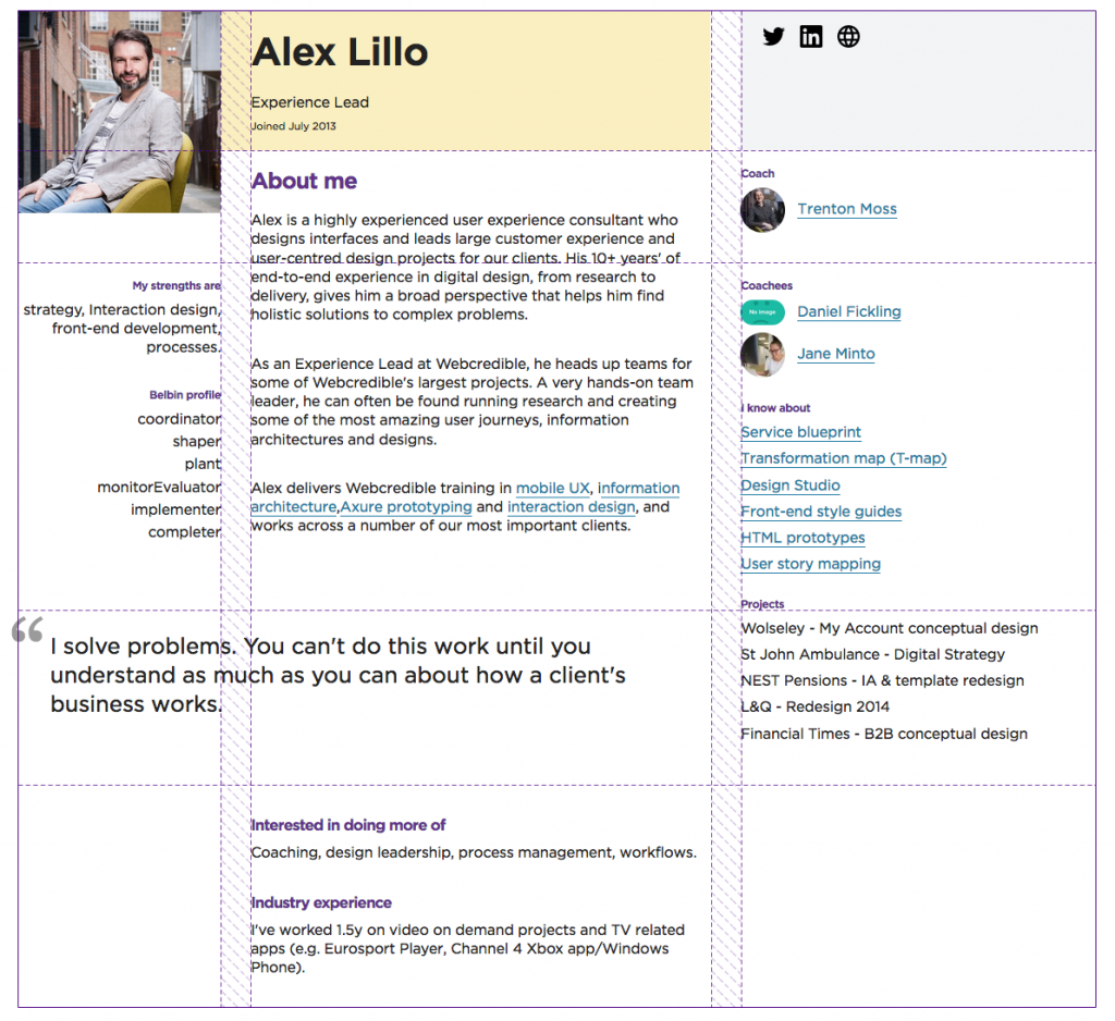
If anything, designers will have to work hard to get out of our comfort zone and start creating compelling layouts that get the most of the medium.
What can I do with CSS Grid?
If you are a UX designer with basic HTML and CSS skills, you can use CSS grid to quickly prototype responsive websites in code. Ignore frameworks, you don’t need them anymore.
For example, I really like what I call content prototypes, very low fidelity designs that help me assess the basic grid and visual hierarchy of the content, in code, using actual devices. CSS Grid is perfect for this and will make my life a lot easier.
Learn how to do it
A great place to start is Rachel Andrews excellent site Grid by example. She also has a book that is high on my to read list, Get Ready for CSS Grid Layout. And her talk in An Event Apart will give all the basic knowledge of how to use CSS grid.
Jen Simmons’ talks are an amazing source of inspiration too, and I plan to follow her recommendation and start paying more attention to print, getting ideas to create different compositions that elevate the content on the web, getting us out of the standard header + 2 columns layout that we’ve been using for the last 15-20 years.
What do you think, would you use CSS grid to prototype?